How to read an options risk/reward graph
Below are example risk/reward graphs showing 1 contract of the RUT Aug ’07 760/770 bull put spread. The first graph shows the RUT Aug ’07 760/770 bull put spread with 37 days until expiration. The next graph shows the risk/reward graph for the same trade 14 days until expiration. The third graph shows the risk/reward graph for the same trade 2 days until expiration.
Because there are 10 points between the leg sold and the leg bought, this trade is classified as a 10 point wide credit spread. In order to open this trade the broker will require and hold $1000 of maintenance.
The right X-axis of the graph below represents the gain or loss of this bull put credit spread. The maximum potential loss is $920 ($1000 of required maintenance held by the broker less $80 of premium collected when we first opened the trade), and the maximum potential gain of this trade is $80 representing the credit collected when we first opened the trade. The long, thin arrow is pointing to the credit of $80 that is collected when the trade is first opened. If the SPX stays above 770 through expiration then we, the seller, will keep the $80 credit. The left Y-axis represents the price of the underlying index, in this case the RUT. The left X-axis represents time showing the chart of the closing values of the RUT index from April 2006 through July 2007. The black horizontal line represents the closing value of the RUT index; for the first graph the RUT closed at 837.48 on 7/10/07, the date shown at the bottom of the graph. The colored lines help us calculate the value of the option trade as a function of time to expiration and a function of the price of the RUT index. For example, the first graph shows the red, blue, green and black lines that can calculate the values of the option trade, as a function of the price of the RUT index, at 37 days, 25 days, 13 days and 0 days until expiration. Continuing with this example using the first graph, at 37 day until expiration, using the red line, the RUT closed at 837.48, showing us that the value of the option trade is approximately negative $85. That is, the trade is drawn down by $85, which represents an unrealized loss, at 37 days until expiration.
Major Candlestick Patterns
Hammer or Hanging Man: A candlestick with a small body and long lower shadow. This candlestick tells us that when the market opened sellers started to sell pulling the price of the stock or index down. But, toward the end of the day buyers jumped in and pushed the stock or index back up, where the closing price ended near the opening price. This price action tells us that the buyers thought that the stock was undervalued and oversold. With this said, if we start to see long shadows like this, it could be a signal that a direction in trend might be coming.
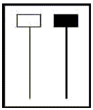
Hanging Man: If the stock or index has been in a up-trend and we see this formation, it’s called a Hanging Man, and many times it’s an indication that the trend is topping out.
The 5-35 oscillator
The 5–35 oscillator is a momentum indicator that is derived by calculating the difference between the value of the 5 period moving average and 35 period moving average. The red histogram on the bottom portion of the chart is a 5-35 oscillator. In this example, the 5 day simple moving average (SMA) of the SPX index is shown on the chart in black, and the 35 day SMA is shown in dark blue. You can see how the value of the 5-35 oscillator/histogram tracks the difference between these two moving averages. Sometimes analysts will describe the 5-35 oscillator as buying or selling “pressure” on a stock or index. When the histogram is above zero there is positive buying pressure, and when the histogram is below zero there is negative selling pressure.
The 17/43 Weekly Exponential Moving Averages
The chart below shows the S&P 500 index, SPX, from 2003 through early 2010 and its associated 17/43 weekly exponential moving averages (EMA). Several analysts at Standard & Poor’s back tested 30 years of stock market data and found that the 17/43 EMA did a good job of keeping investors in the market during UP-trending periods, and triggered investors to move to the sidelines during bear markets. A bullish trigger is when the 17 week EMA crosses above the 43 week EMA, and a bearish trigger is when the 17 week EMA crosses below the 43 week EMA. Note how the 17 week EMA stayed above the 43 week EMA from mid 2003 through January 2008 keeping investors in the market during the 5 years of an up-trending market. Moreover, note how it warned investors to get out of the market in January 2008, which happened to be the exact start of the ’08/’09 recession.
The MACD Indicator
Developed by Gerald Appel, the Moving Average Convergence/Divergence Indicator (MACD) is one of the simplest and most reliable indicators available today. The first line created is the MACD Graph (thick black line) and is calculated by taking the difference between the 26 day Exponential Moving Average (EMA), based on closing price, and the 12 day EMA, which creates a momentum oscillator that oscillates above and below zero. The second line created is the MACD trigger line (thin red line) which is a smoothed, 9 day EMA of the MACD graph.
The Relative Strength (RSI) Index
The Relative Strength Index (RSI) is a popular momentum oscillator that was developed by J. Welles Wilder. The RSI compares the magnitude of a stock or index’s recent gains to the magnitude of its recent losses and converts this information into a number that ranges from 0 to 100. Below is an example of the DOW index with its 20, 50, 100 and 200 day simple moving averages (SMA), and the RSI oscillator.
The Average Directional Index (ADX or DMI) Technical Indicator
The Average Directional Index (ADX), developed by J. Welles Wilder Jr. and also sometimes called the Direction Movement Index, or DMI, is used to evaluate the strength of a trend, be it up or down. The ADX indicates when a trend is present and the overall strength of the trend. The higher the ADX the stronger the trend.
The ADX system comprises three lines; +DI,–DI and the ADX line.
A) Positive Directional Indicator (+DI; thin green line) indicates the strength of upward price pressure
B) Negative Directional Indicator (–DI; thin red line) indicates the strength of downward price pressure
C) Average Directional Index (ADX line; thin black line) shows the overall strength of a trend without regard to direction. The higher the ADX, over 20, the stronger the trend.
Bollinger Bands
Bollinger Bands are widely used by professional traders and fund managers, and are designed to answer the question whether the price of a stock or index is high or low on a relative basis. Armed with this information, traders can make buy and sell decisions by using additional technical indicators to confirm price action of the stock or index they are trading. The Bollinger band does not give absolute buy and sell signals simply by having been touched; rather, it provides a framework within which price may be related to other technical indicators.
Bollinger Bands are formed by calculating two standard deviations around a 20 day simple moving average of an underlying index or stock. Two standard deviations include about 95% of the chart’s price data between the two trading bands. Because the standard deviation calculation is based on volatility, as the stock or index’s volatility changes the width of the “envelope” will increase or decrease correspondingly.
Accumulation/Distribution Line
The Accumulation/Distribution Line (A/D line) was developed by Marc Chaikin and is one of the popular volume flow indicators to assess the early cumulative flow of money into and out of a security, which can anticipate price moves of the stock. An up-trending A/D Line suggests that buying pressure is building on higher volume, and a down-trending A/D Line indicates that selling pressure is building on higher volume. The basic premise behind the A/D line is that an increase in the volume of shares traded, e.g. per day, will precede an eventual move in the price of the stock. Many times before a stock advances there will be a period of increased volume in the stock on the UP days just prior to the price move of the stock. The A/D line focuses on the price action for a given period (e.g. daily) and generates a value based on the location of the close, relative to the range for the day. We will call this value the “Close Location Value” or CLV. The CLV ranges from plus one to minus one with the center point at zero. Below is a summary of the the rules to calculate CLV.
Chaikin Money Flow
Building on the Accumulation/Distribution Line that was discussed in a separate learning center post, the formula for the Chaikin Money Flow (CMF) is the cumulative total of the Accumulation/Distribution values for 21 periods, divided by the cumulative total of volume for 21 periods. Below is an example, courtesy of stockcharts.com showing what the CMF looks like. The purple box encloses 21 days of Accumulation/Distribution (A/D) Values. The total A/D values over 21 days divided by the total volume over 21 days forms the value of CMF at the end of that 21 day series, denoted by the purple arrow. To calculate the next day, the A/D value from the first day is removed and the value for the next day is entered into the equation. Generally speaking, CMF is bullish when it is positive indicating that the security is under accumulation. CMF is bearish when it is negative, indicating the security is under distribution.
ISE Call/Put Ratio Sentiment Index (ISEE)
The International Securities Exchange (http://www.ise.com) equity only call/put ratio investor sentiment index (ISEE) is more refined than traditional put/call ratios because it only uses opening long customer transactions to calculate bullish/bearish market sentiment. Opening long transactions, i.e. where the investor “buys-to-open” a call or put leg, are thought to best represent market sentiment because investors often buy call and put options to express their actual market view of a particular stock. Short orders (i.e. sell-to-open) are excluded since myriad options strategies could be involved and thus are not representative of true investor sentiment. Furthermore, trades from market makers and institutional broker/dealers are excluded since their trades are usually part of more complex trades, such as spreads, butterflies, diagonals…etc. so these trades can “muddy the waters”. As a result, the ISEE calculation method allows for a more accurate measure of true investor sentiment than traditional put/call ratios. Moreover, the ISEE focuses on equities only and does not include options opened on ETFs and indexes, because many of the trades on ETFs and Indexes are used as hedging instruments, so they reflect less accurately on true investor sentiment.
Investors Intelligence Bull/Bear Ratio Measuring Investor Sentiment
The Investors Intelligence Bull/Bear indicators are well respected gauges of overall investor sentiment. Below is a chart showing the percent of investors that are bullish versus bearish. In general, when the percent of investors that are bullish moves above 60% this demonstrates an extreme level of optimism.
McClellan Oscillator & Summation Index
The McClellan Oscillator is one of the more accurate and modernized market breadth indicators available and is based on the smoothed difference between the number of advancing and declining issues on a broad-based index, such as the NYSE Composite, the S&P 500 Index, or the NASDAQ Composite.
We are interested in monitoring market breadth because it tells us what percent of the market is actually participating in a rally or a sell-off. Because many of the broad-based indexes are market-cap weighted (market cap = number of outstanding shares * share price), sometimes just a handful of the largest companies that reside in an index can artificially move the index. For example, if Exxon and Chevron both rally 1.5% due to a positive energy report, because these two companies represent 5% of the S&P 500 index, these two companies alone could move the index; however, the remaining 498 stocks might have all closed down or flat for the day and we wouldn’t have known it. Therefore, it’s prudent to watch a market breadth indicator, like the McClellan Oscillator, to provide us a more accurate picture of what “all” of the stocks are doing in the index.
Stochastic Oscillator
The Stochastic Oscillator is a technical momentum indicator that compares a security’s closing price to its price range over a given time period, usually 14 periods. (1 period = 1 day for this example) This indicator is calculated with the following formula:
%K = 100[(C – L14)/(H14 – L14)]
%D = Smoothed, 3 day simple moving average of %K
C = the most recent closing price
L14 = the low of the 14 previous trading sessions
H14 = the highest price traded during the same 14-day period
As an example, below is a table of daily highs, lows and closing prices for a particular index over 14 trading days. On day 14, %K would be calculated as shown below where C=115.38, L14=109.13, and H14=119.94.
Williams %R Indicator
Developed by Larry Williams, Williams %R, also known simply as %R, is a momentum indicator that is popular for measuring overbought and oversold levels. The scale ranges from 0 to negative 100 with readings from 0 to -20 considered overbought, and readings from -80 to -100 considered oversold. The %R indicator shows the relationship of the close relative to the high-low range over a set period of time, usually 9, 14 or 28 days. The nearer the close is to the top of the range, the nearer to zero (higher) the indicator will be. The nearer the close is to the bottom of the range, the nearer to -100 (lower) the indicator will be. If the close equals the high of the high-low range, then the indicator will show 0 (the highest reading). If the close equals the low of the high-low range, then the result will be -100 (the lowest reading).
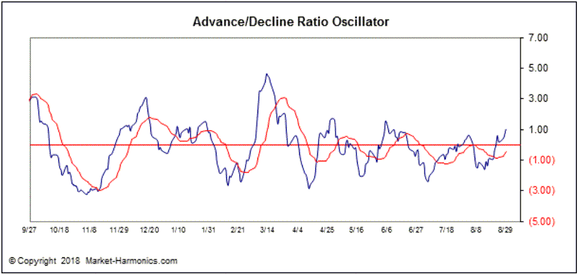
Advance/Decline Ratio Oscillator (ADRO)
The advance/decline line is a popular market breadth indicator. It is a simple measure of how many stocks are taking part in a rally or sell-off and it’s usually calculated from NYSE stocks. The A/D line is calculated as follows:
A/D Line = (number of advancing stocks for the day – number of declining stocks for the day) + yesterday’s A/D line value
The Advance/Decline Ratio Oscillator (ADRO) is a variation on the advance/decline line where it accounts for total market volume beyond the NYSE. The ADRO has a tendency to identify near-to-intermediate tops when the indicator is above 4.00, and near-to-intermediate bottoms when the indicator is at -2.00 or below. Chart courtesy of Market Harmonics.
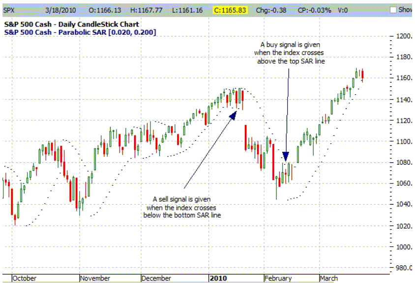
Parabolic SAR
Developed by Welles Wilder, creator of RSI and DMI, the Parabolic SAR sets trailing price stops for long or short positions. Also referred to as the stop-and-reversal indicator (SAR stands for “stop and reversal”), Parabolic SAR is more popular for setting stops than for establishing direction or trend. Wilder recommended establishing the trend first, and then trading with Parabolic SAR in the direction of the trend.
Elliott Wave Analysis
For a tutorial on Elliott Wave analysis, please visit https://stockcharts.com/school/doku.php?id=chart_school:market_analysis:elliott_wave_theory
Aruoba Diebold Scotti Business Conditions Index (ADS)
The ADS Index is one of several macro-level indicators tracking the overall health of the US economy. This index is a diffusion of 6 economic components: Weekly initial jobless claims; monthly payroll employment; industrial production; personal income less transfer payments; manufacturing and trade sales; and quarterly real GDP. The ADS index is updated in almost real-time with “high-frequency” economic data.
The average value of the ADS index is zero. Progressively bigger positive values indicate progressively better-than-average conditions, whereas progressively more negative values indicate progressively worse-than-average conditions. The ADS index may be used to compare business conditions at different times. A value of -3.0, for example, would indicate business conditions significantly worse than at any time in either the 1990-91 or the 2001 recession, during which the ADS index never dropped below -2.0.
Economic Cycle Research Institute (ECRI) Weekly Leading Index (WLI)
ECRI is a respected independent economic research houses, and they have a good track record of predicting when recessions begin and end. One of their more popular leading economic indicators is the Weekly Leading Index (WLI). Below is the chart of the WLI July 2018. For more information about ECRI and the WLI Index please visit www.businesscycle.com.